I know the differences between these metrics are inconsequential because the happiness view doesn’t start at 0, but it still makes me want to shout “what the fuck are gentoo users so happy about” lol
Fair enough, it’s just one of those distros you find a lot of those elitists in. Even had a “friend” tell me I wasn’t really a Linux user because I don’t use arch, then gentoo, then openbsd
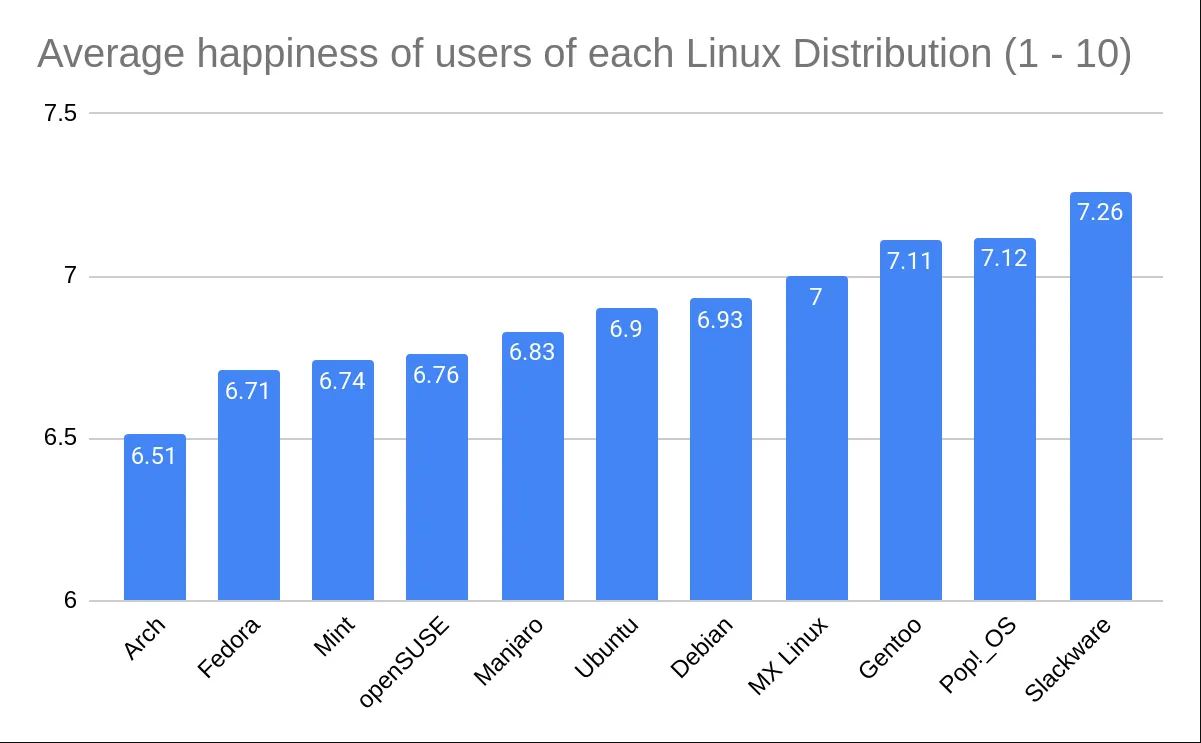
The scale on the left doesn’t start at zero, so the difference is smaller than the size of the bars make it seem. The difference between #1 Slackware, and last spot Arch, is 0.75 points in a 0 to 10 scale, but the bar size of Slackware is about 2.5x bigger than the bar for the Arch users.
Just to kind of demonstrate that idea, I’ve recreated the graph in Excel with the axis starting at 0. I think Excel might actually be to blame for this happening so much, its auto selection actually wanted to pick 6, gross.
This is indeed misleading. It has no numerical figures, and it wastes loads of ink and screen space. The other one is better structured as a chart. I a sorry you spent your time to demonstrate something we all know, but may be Excel has good reasons that cuts off the axis at 6.

I know the differences between these metrics are inconsequential because the happiness view doesn’t start at 0, but it still makes me want to shout “what the fuck are gentoo users so happy about” lol
Not needing to deal with arch users, also having nice reading time (compiling a Firefox update on a laptop)
Sometimes it’s hard to tell the difference between arch and some gentoo users
Because it works and we didn’t need to change anything in the last 20 years. I don’t even think about it.
Whenever I try something else, problems come as soon as I want something that’s not default. Which is often.
I don’t even know how to install Gentoo. I did it two times, second time was when upgrading to 64bit architecture.
Fair enough, it’s just one of those distros you find a lot of those elitists in. Even had a “friend” tell me I wasn’t really a Linux user because I don’t use arch, then gentoo, then openbsd
How is that so?
The scale on the left doesn’t start at zero, so the difference is smaller than the size of the bars make it seem. The difference between #1 Slackware, and last spot Arch, is 0.75 points in a 0 to 10 scale, but the bar size of Slackware is about 2.5x bigger than the bar for the Arch users.
Fair. You know these figures right out from the graph don’t you?
Just to kind of demonstrate that idea, I’ve recreated the graph in Excel with the axis starting at 0. I think Excel might actually be to blame for this happening so much, its auto selection actually wanted to pick 6, gross.
This is indeed misleading. It has no numerical figures, and it wastes loads of ink and screen space. The other one is better structured as a chart. I a sorry you spent your time to demonstrate something we all know, but may be Excel has good reasons that cuts off the axis at 6.
The axis is cut off below 6, so the difference between the columns’ size isn’t representative of the actual scale